 Brand Guidelines
Colors
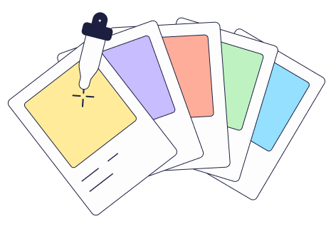
For the colors in our new brand identity, we’re embracing a fresh and vibrant palette designed to reflect the essence of Prime Club - dynamic, optimistic, and full of possibilities.

Inspired by the equity of bold and memorable colors, we’ve created a harmonious combination that captures the spirit of our brand and speaks to our commitment to innovation and connection.
Each color has its own palette of pastel shades, making them not only visually appealing but also highly versatile-ideal for everything from illustrations to supporting graphic elements.
When used in illustrations, these pastels breathe life into our designs, giving them depth and dimension. They are gentle on the eyes and perfect for digital interfaces, ensuring that every interaction with our brand feels delightful and inviting.
1. Color Harmony
Colors have this incredible way of working together to create something truly special-like peanut butter and jelly. When used together, they bring balance, depth, and energy to your designs, making them unforgettable . Make sure to add in a dark shade and a white to balance everything out.
2. Dynamic Duos
when two colors team up, magic happens. It’s all about balance-contrasts that intrigue or harmonies that soothe. A well-paired duo adds depth and dimension, creating a visual dance that keeps the eye engaged.
3. Monochromatic
Sometimes, all you need is one bold hue to make a statement. A single color can bring clarity, set the mood, and create an instantly recognizable look. Perfect for moments when less is more.
See a variety of references below
Color Harmony
Dynamic Duos
Monochromatic